UX Improvements for Coverage Validator
We recently released new versions of the Coverage Validator tools for all languages.
The main reason for this release was to make the tools more usable and make using them more satisfying. This work was inspired by some user experience research we commissioned with Think UI.
We’re so happy with these improvements we thought we’d share them so that you can learn from our improvements. We’re not finished with the Coverage Validator tools. This is just the start of changes to come.
I’m specifically going to talk about C++ Coverage Validator, but these improvements cut across all our Coverage Validator tools. Some of the improvements cut across all our development tools.
Summary Dashboard
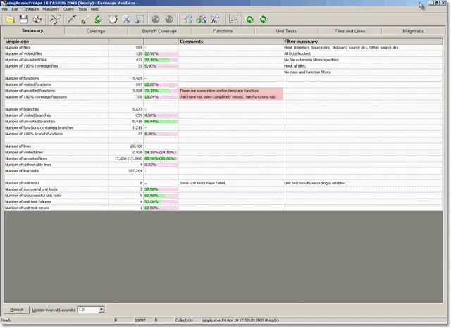
The first thing a user of Coverage Validator sees is the summary dashboard.
The previous version of this dashboard was a grid with sparse use of graphics and lots of text. You had to read the text to understand what was happening with the code coverage for the test application. Additional comments and filter status information was displayed in right hand columns.
The new version of this dashboard is split into two areas. The top area contains a dial for each metric reported. Each dial displays three items of information: Number of Items, Number of Items visited. How many items are 100% visited. This is done by means of an angular display for one value and a radial display for another value. A couple of the dials are pie charts.
The bottom area of the dashboard displays information that is relevant to the recorded session. Any value that can be viewed or edited is easily reachable via a hyperlink.
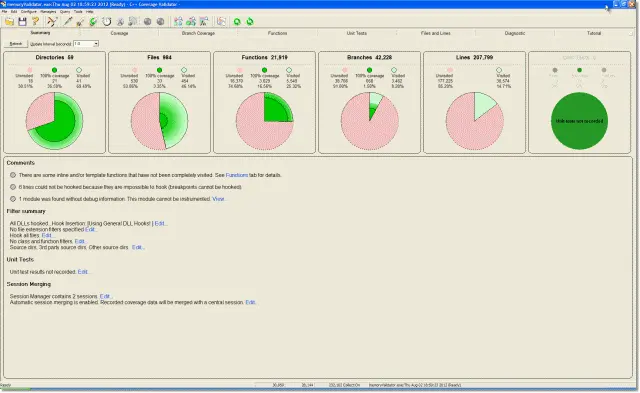
The result of these changes are that the top area makes it easy to glance at a coverage report and instantly know which session has better coverage than another session. You don’t need to read the text to work it out. The bottom area draws attention to instrumentation failures (missing debug information, etc) and which filters are enabled etc. By exposing this information in this way more functionality of Coverage Validator is exposed to the user of the software.
Coverage Dials
We developed a custom control to display each coverage dial.
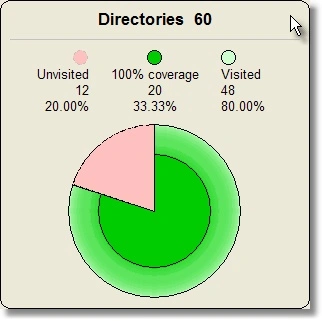
A coverage dial displays both the amount of data that has been visited, the amount of data that is unvisited and the amount that has been completely visited. For metrics that do not have a partial/complete status the dial just displays as a two part pie chart. An additional version displays data as a three part pie chart. This last version is used for displaying Unit Test results (success, failure, error).
 |
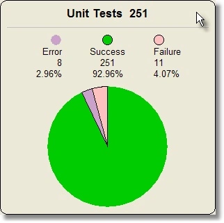 |
The difference between unvisited coverage and visited coverage is displayed using an angular value. Items that have been completely visited (100% coverage) are displayed using a radial value emanating from the centre of the dial. Additional information is displayed by a graded colour change between the 100% coverage area and the circumference of the circle to indicate the level of coverage in partially covered areas.
The coverage dial provides tooltips and hyperlinks for each section of the coverage dial.
Dashboard Status
The dashboard status area shows informational messages about the status of code instrumentation, a filter summary, unit test status and session merging status. Most items are either viewable or editable by clicking a hyperlink.
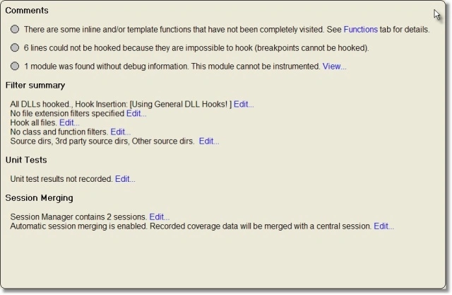
To implement the hyperlink we created a custom control that supported hyperlinks with support for email hyper links, web hyper links and C++ callbacks. This provides maximal functionality. The hyperlinks are now used in many places in our tools – About box, evaluation feedback box, error report boxes, data export confirmation boxes, etc.
Coverage Scrollbar
We’ve also made high level overview data available on all the main displays (Coverage, Functions, Branches, Unit Tests, Files and Lines) so that you can get an overview of the coverage of each file/function/branch/etc without the need to scroll the view.
We thought of drawing the coverage data onto the scrollbar. Unfortunately this means that you would need an ownerdrawn scrollbar, but Windows does not provide such a thing. An option was to use a custom scroll bar implementation. But doing that would mean having to cater to every different type of Windows scrollbar implementation. We didn’t think that was a good idea. As such we’ve chosen to draw the coverage overview next to the scroll bar.
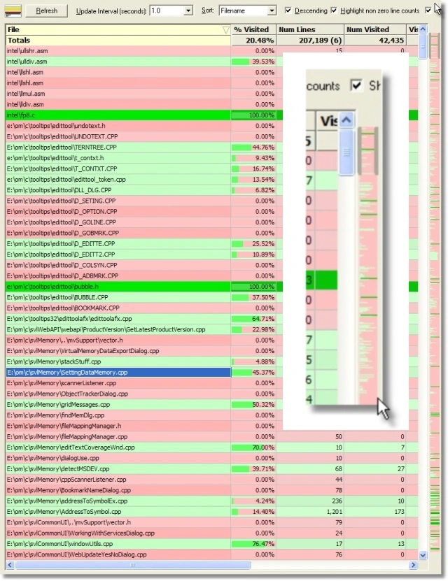
Editor Scrollbar
Similarly to the overview for each type of data we also provide a high level overview for the source code editor.
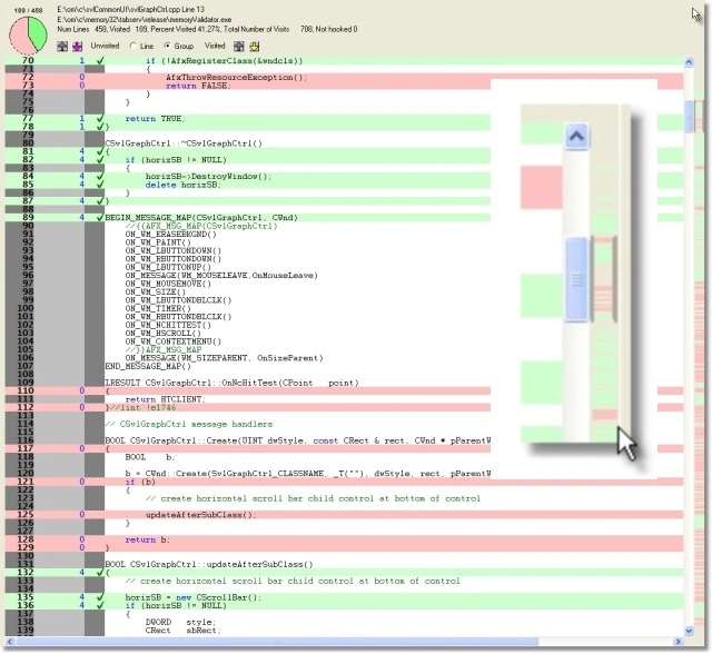
Directory Filter
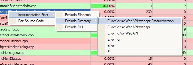
Coverage Validator provides the ability to filter data on a variety of attributes. One of these is the directory in which a file is found. For example if the file was e:\om\c\svlWebAPI\webapi\ProductVersion\action.cpp the filter directory would be e:\om\c\svlWebAPI\webapi\ProductVersion\.
This is useful functionality but Coverage Validator allows you to filter on any directory. In complex software applications it’s quite possible that you would want to filter on a parent directory or a root directory. That would give the following directories for the example above.
| e: |
| e:\om |
| e:\om\c |
| e:\om\c\svlWebAPI |
| e:\om\c\svlWebAPI\webapi |
| e:\om\c\svlWebAPI\webapi\ProductVersion |
The solution to this problem is to create the context menu dynamically rather than use a preformed context menu stored in application resources. Additionally it is more likely that the current directory will be filtered rather than the parent, so it makes sense to reverse the order of the directories, going from leaf to root.
Instrumentation Preferences
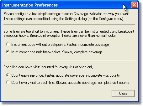
The instrumentation preferences dialog is displayed to the user the first time that Coverage Validator starts. The purpose of this dialog is to configure the initial way coverage data is collected. This provides a range of performance levels from fast to slow and incomplete visit counts to complete visit counts. Both options affect the speed of execution of the software. Given that time to complete is an important cost for this is an option that should be chosen carefully.
Previous versions of the software displayed a wordy dialog containing two questions. Each question had two choices.
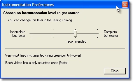
The new version of the instrumentation preference dialog has replaced the questions with a sliding scale. Two questions with two choices is effectively four combinations. The instrumentation level sliding scale has four values. As the slider value changes the text below the slider changes to provide a brief explanation of the instrumentation level chosen.
An additional benefit is that the previous version only implied the recommended values (we preset them). The new version also implies the recommended value (also preset) but also explicitly indicates the recommended instrumentation level.
This new design has less words, less visual clutter, is easier to use and presents less cognitive load on the user.
Export Confirmation
Coverage Validator provides options to export data to HTML and XML. A common desire after exporting is to view the exported data. Previous versions of Coverage Validator overlooked this desire, no doubt causing frustrating for some users. We’ve rectified this with a confirmation dialog displayed after exporting data. The options are to view the exported file or to view the contents of the folder holding the exported data. An option to never display the dialog again is also provided.

Debug Information
The previous version of the debug information dialog was displayed to the user at the end of instrumentation. After the user dismissed the dialog there was no way to view the data again. The dialog was simply a warning of which DLLs had no debug information. The purpose of this was to alert the user as to why a given DLL had no code coverage (debug information is required to provide code coverage).
The new version of debug information dialog is available from the dashboard. The new dialog displays all DLLs and their status. Status information indicates if debug information was found or not found and if Coverage Validator is interested in that DLL, and if not interested, why it is not interested. This allows you to easily determine if a DLL filter is causing the DLL to be ignored for code coverage.
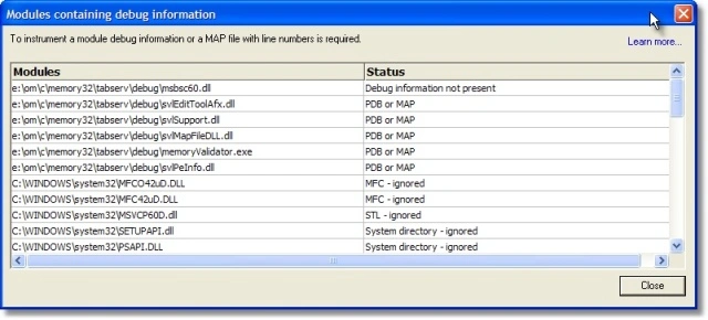
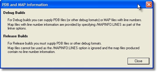
When the dialog is displayed a Learn More… link is available. This presents a simple dialog providing some information about debug information for debug and release builds. We’ve used a modified static control on these dialogs to provide useful bold text in dialogs (something that you can’t do with plain MFC applications). It’s a small thing but improves structure of the dialog. This text was displayed as part of the previous debug information dialog. Removing this text to a separate dialog chunks the information making it more accessible.
There is more to be done with this part of the software but this is an improvement compared to previous versions.
Tips Dialog
Coverage Validator has always had a “Tip of the day” dialog. This is something of a holdover from earlier forms of application development. We’d never really paid much attention to it, to how it functioned, how it behaved and what it communicated.
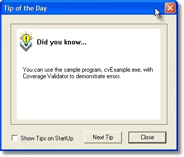
We’re planning to completely overhaul this dialog but that is a longer term activity. As such in this revision we’ve just made some smaller scale changes that still have quite an impact.
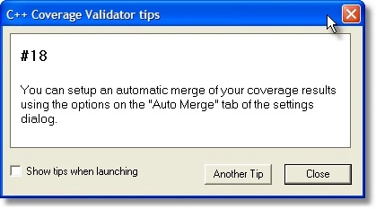
The first change is that the previous “Tip of the day” dialog was displayed at application startup but with the new version the “Tips” dialog is no longer displayed at application startup. The tips dialog is now displayed when you launch an application and are waiting for instrumentation to complete. This means you get displayed tips during “dead time” that you can’t really use effectively – you’re waiting for the tool. The tips dialog is still available from the Help menu as was the previous Tip of the day dialog.
The second change is that the new Tips dialog is modeless. The previous Tip of the day dialog was modal. This means you can leave the dialog displayed and move it out of the way. You don’t have to dismiss it.
We’ve done away with the icon and replaced it with a tip number so you know which tip you are viewing. Tips are no longer viewed sequentially (Next Tip) but in a random order. At first this seems like a crazy thing to do. But when you try it, it actually increases your engagement. You’re wondering how many tips there are and which one you’ll get next. Hipmunk was an inspiration for this – they do something similar when calculating your plane flights (I hadn’t seen this when I used Hipmunk but Roger from ThinkUI had seen it).
There is more to be done with this part of the software but this is a useful improvement until our completely reworked Tips dialog is ready for release.
Conclusion
All of the changes have been made to improve and simplify the way information is communicated to the user of Coverage Validator. Improved graphics displays, interactive dashboards, better data dialogs, hyperlinks and occasional use of bold text all improve the user experience.
We’re not finished improving Coverage Validator. These are just our initial round of improvements.